Lego, the iconic brand that has been synonymous with creativity, imagination, and vibrant play experiences for decades, recently underwent a significant brand update. Spearheaded by Interbrand, a heavyweight in the branding world, the new look promised to usher Lego into a fresh era. However, as the dust settles and the colorful bricks of opinion stack up, it’s evident that not everyone is applauding this makeover. In this deep dive, we’ll explore the highs and lows of Lego’s latest brand iteration, dissecting its design choices, cultural relevance, and potential impact on its diverse audience.
The Promise of a New Era
As the curtain rises on Lego’s brand refresh, anticipation swirls among enthusiasts and consumers alike. The stage is set for a transformation that seeks to capture the essence of Lego’s timeless brand appeal while injecting it with a modern twist. Yet, as the unveiling unfolds, it becomes clear that the reception may not be as enthusiastic as expected.
A Dull Palette and Missed Mark
The first brushstroke of disappointment comes with the color palette. Where once Lego boasted hues as vibrant as a child’s imagination, the new colors fall flat, akin to a Monday morning without coffee. The brand, once bursting with life, now feels passive and sterile. It’s a stark departure from the dynamic energy that has defined Lego for generations.
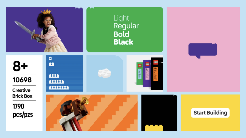
Furthermore, the brand update seems to miss its target audience entirely. Instead of focusing on the joy and wonderment of children and adults who revel in Lego’s creative possibilities, the emphasis shifts to obscure pop culture references that leave many scratching their heads. From Jaws posters to nods at video game aesthetics, the connection to Lego’s core identity feels tenuous at best.

Design Details vs. Consumer Connection
Amidst the sea of disappointment, there are islands of praise for certain design elements. The utilization of brick shapes to create visual patterns and animations demonstrates a commendable level of creativity. Similarly, the introduction of a custom font injects a welcome breath of fresh air into an otherwise lackluster landscape. However, these nuances may be lost on the average consumer, serving as mere window dressing rather than substantive improvements to the Lego experience.

Representation and Authenticity
In an era where diversity and inclusivity reign supreme, Lego’s brand update falters in its portrayal of people. While attempts are made to incorporate diverse characters, the execution feels tokenistic and out of touch. The inclusion of a black girl wielding a Lego sword may be well-intentioned, but it rings hollow in the absence of genuine representation that reflects the diverse tapestry of Lego’s global audience.

The Verdict
As the curtain falls on Lego’s brand update, the reviews are mixed, with disappointment outweighing delight. While Interbrand’s efforts to revitalize the beloved brand are commendable, the execution leaves much to be desired. In the end, Lego’s latest iteration may be remembered more for its missed opportunities than its successes. Only time will tell if this brand refresh proves to be a stepping stone or a stumbling block in Lego’s storied journey.
Conclusion
In the ever-evolving landscape of branding and design, even the most iconic brands must adapt to stay relevant. However, as Lego’s latest brand update demonstrates, change for the sake of change risks alienating the very audience it seeks to engage. As fans and critics alike continue to voice their opinions, one thing remains certain: Lego’s colorful bricks will endure, serving as a timeless symbol of creativity and imagination for generations to come.
If you’re embarking on a rebranding initiative, consider pausing to consult with one of our brand strategists. Avoid the pitfalls that Lego encountered with their recent update. Schedule a complimentary consulting session today to ensure your rebranding effort is a success.
