Creating a logo is more than just a creative endeavor; it is a strategic process that involves understanding your target audience intimately and the message you want to convey. A well-designed logo can become a powerful asset, contributing significantly to a brand’s recognition and success. In this logo design guide, we will unlock the key principles for designing the perfect logo for your company and provide real-life examples from iconic brands to help illustrate the process.
1. Keep it Simple
Simplicity is the cornerstone of effective logo design. While complex shapes and intricate details might seem appealing initially, they often fail to achieve strong brand recall. A simple, clean design is more versatile and memorable, making it easier to use in various environments. For example, logos with gradients or fine lines become problematic in single-color applications or when reduced in size. Similarly, complex shapes with intricate details lose clarity and impact when scaled down for common uses, such as website favicons. A straightforward design ensures consistency and recognizability across all mediums.
The Nike swoosh is a prime example of simplicity in logo design. Created by Carolyn Davidson in 1971, the swoosh is a curved checkmark that conveys motion and speed. It is easily recognizable and scalable, appearing on everything from shoes to billboards with the same impactful presence. This simple shape has become synonymous with athletic excellence and innovation.
2. Focus on Shape Associations
Using shapes that evoke familiar objects or symbols can enhance the memorability of your logo by establishing an immediate connection with your audience. However, there is a fine line to navigate. Overly familiar concepts can result in a logo that looks generic and lacks uniqueness. For instance, choosing a lightbulb to represent a think tank is an obvious choice but not effective, as this concept is overused and lacks strong recall power due to its ubiquity. To stand out, aim for a balance between recognition and originality.
The Apple logo, a simple apple with a bite taken out of it, is one of the most iconic logos in the world. Designed by Rob Janoff in 1977, the apple shape is universally recognized, and the bite adds a distinctive touch that makes it unique. This association with an everyday object helps the logo stand out and be easily recalled.
3. Never Incorporate More Than Three Concepts
A logo should convey a clear message without being overloaded with ideas. Incorporating too many concepts can dilute the brand’s identity, making the logo confusing and forgettable. Even if your brand offers multiple services, not all need to be represented in the logo. Instead, focus on what your entire brand stands for and design a logo that captures that essence. For example, if your brand provides various security services, you don’t need to include a lock, fort, gun, satellite, and tank in the logo. Instead, you could choose a symbol that represents security and protection, such as a wolf, which symbolizes protection and guidance in the face of danger.

Starbucks’ logo, featuring a twin-tailed siren, is an example of balancing simplicity with a strong concept. The siren represents the sea, coffee’s global trade routes, and the brand’s origins in Seattle, a port city. By focusing on a single, strong concept, Starbucks has created a logo that is both distinctive and deeply connected to its brand story.
4. Choose a Maximum of Two Colors
Color choice is critical in logo design. Using a maximum of two colors ensures the logo remains visually cohesive and easy to reproduce across various mediums. These colors should either be harmonious or provide a strong contrast to stand out. Limiting your color palette to one or two shades allows you to own that color as a brand identifier.
For instance, T-Mobile has made magenta and black integral to its identity, Coca-Cola is synonymous with red, and IKEA is instantly recognizable by its yellow and navy palette. These examples show how powerful color ownership can be in establishing and reinforcing brand identity.
5. Choose an Appropriate Typeface
Typography plays a crucial role in logo design. Long business names should use simple, legible fonts to ensure clarity, while short names can afford more creativity and stylization. Fonts significantly impact how a brand is perceived. For a serious business, a simple yet strong typeface conveys reliability and professionalism. Conversely, a rigid, structured font would be detrimental to a casual or creative brand, like a restaurant. Fonts, like monograms, can either enhance or undermine the effectiveness of your logo and brand. Choosing the appropriate font is essential. Serif fonts often convey history and elegance, while sans-serif fonts provide a casual yet professional look. A bold typeface may suit a company that builds weapons, whereas a slender font could be ideal for a hair salon.
Coca-Cola’s logo uses a distinctive, flowing script that is both elegant and memorable. Despite its length, the name is easy to read because of its unique and consistent styling. On the other hand, Google’s logo uses a simple, sans-serif font that is highly legible. The playfulness of the multicolored letters adds a touch of creativity to the straightforward design.
6. Ensure Adaptability Across Mediums
A successful logo should be versatile enough to work across different mediums and applications. This adaptability allows the brand to maintain a consistent identity regardless of where the logo appears. It’s important not to confuse adaptability with scalability. While your logo needs to be simple enough to scale without any legibility issues, it also needs to have an adaptable system that ensures the brand is easily identifiable in any format.
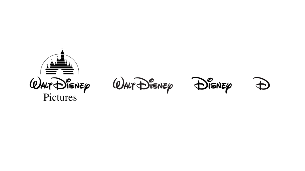
Disney’s main logo is elaborate and uses the full company name. However, they have invested significant effort in creating alternative versions, including simplified typefaces and a standalone “D.” This adaptability has made Disney’s brand instantly recognizable across various mediums, ensuring consistent brand identity whether on a billboard, a mobile app, or a piece of merchandise.
Conclusion
Designing the perfect logo requires a balance of creativity and strategic thinking. By focusing on simple shapes, shape associations, a limited number of concepts and colors, appropriate typography, and ensuring adaptability, you can create a logo that is both memorable and effective. The examples provided illustrate how these principles can be applied to achieve iconic and successful logos. As you embark on your logo design journey, remember that simplicity, clarity, and consistency are your best allies. If you need assistance in designing a new logo or updating an existing one schedule a session with one of our collaborating brand strategists today.

